
A real-time risk dashboard is a live, role-based view that shortens the gap between a risk event and a decision by surfacing current scores, thresholds, and triggers as they change. It serves CROs, portfolio managers, compliance leads, and board audiences who each need a different slice of the same data. The core payoff is speed: faster detection means faster mitigation, not just prettier reporting.
TL;DR:
- Real-time risk dashboards should include a composite risk index with confidence ranges, threshold alerts, and drill-through evidence links for auditability.
- Implementing an overlay approach using hybrid ingestion, lightweight read models, and clear latency budgets avoids costly core system replacements.
- Dashboard metrics must be role-specific, visualized with context, and reviewed on cycles appropriate to the risk's urgency, such as hourly for cyber or seconds for trading.
- Data sources require validation, ownership, SLA commitments, and traceability to maintain trustworthiness and support audit requirements.
- Deployment success hinges on defining decision goals first, running scoped pilots, and providing role-based training to ensure adoption without scope creep or alert fatigue.
Maintain 100% NCUA & OCC Audit Readiness
Monitor regulatory updates 24/7, check internal credit policies, and generate compliance trails with Erina (AI Regulatory Agent).
Table of Contents
- What Features Should a Real-Time Risk Dashboard Include?
- How Do You Build a Real-Time View Without Ripping Out Core Systems?
- Which KPIs and KRIs Actually Belong on the Dashboard?
- Where Should the Data Come From, and Who Owns It?
- How Should You Roll Out a Real-Time Dashboard Without Breaking Adoption?
- Why RiskInMind's Approach Matters for Financial Institutions
- What Security and Privacy Controls Does a Real-Time Dashboard Need?
- What Goes Wrong When Institutions Deploy Real-Time Dashboards?
- Where Are Real-Time Risk Dashboards Already Proving Their Value?
- When Is Real-Time Visibility Essential, and When Is It Overkill?
- Get a Real-Time Dashboard Built for Your Institution
- Sources
- FAQ
What Features Should a Real-Time Risk Dashboard Include?
Most vendors will show you a wall of charts and call it "real-time." The features that actually change decision speed are narrower than that, and they map to a short list you should demand before signing anything.
Start with a live composite risk index that blends multiple signals into one score, rather than forcing a reviewer to mentally average five separate feeds. BlackRock's geopolitical risk dashboard is a useful reference model here: it combines an attention score with a market-movement index, weighting recent readings more heavily, then normalizes the result against historical averages. A composite index built this way produces steadier alerts than any single-source signal because noise in one input gets diluted by the others.
Beyond the headline score, the widgets that separate a working dashboard from a decorative one include:
- Confidence bands around composite scores, showing the range of uncertainty rather than a false-precision single number.
- Heatmaps and deviation visuals that flag exceptions against a baseline instead of raw counts.
- Threshold-based alerting with SLA meters and renewal-risk scores that escalate before a limit breaches, not after.
- Financial exposure and scenario meters with drill-down into the positions or accounts driving a number.
- Role-based templates for board, CRO, and operational audiences, each pre-filtered to decision-relevant metrics.
- Evidence-linked drill-through on every KPI, tracing a figure back to its source feed and timestamp.
That last point matters more than it sounds. A risk dashboard features checklist for financial institutions built for banks and credit unions recommends designing every displayed figure so it's traceable to a named source and owner, with a single click revealing the timestamp, feed, and last validation checkpoint behind it.
Pro Tip: When a vendor demo shows you a slick composite score, ask them to click into it and show the contribution breakdown. If they can't show you what moved the number, the score is a black box, and black boxes don't survive audit season.
How Do You Build a Real-Time View Without Ripping Out Core Systems?
Full core-system replacement is rarely the right first move, and the practitioner literature backs that instinct. A pragmatic overlay approach that layers event feeds and materialized read models on top of existing transactional systems can deliver useful near-real-time visibility without a multi-year rewrite.
A workable architecture pattern generally follows four steps:
- Hybrid ingestion. Combine change-data-capture (CDC) streams for continuous updates with scheduled batch loads for slower-moving reference data, so you're not forcing every source into a real-time mold it doesn't need.
- Latency budgeting. Decide upfront which metrics genuinely need sub-second updates versus hourly refresh, then introduce materialized views only where the latency budget demands it.
- Lightweight read models. Build a cache or read-optimized layer specifically for dashboard queries, so analysts hammering the dashboard never touch the transactional database directly.
- Idempotent, auditable updates. Every write to the dashboard's data layer should be replayable and traceable, preserving an audit trail even when the same event gets reprocessed.
An overlay dashboard wins when your core systems are stable and the goal is visibility. A full platform replacement only makes sense when the underlying transactional architecture itself is the bottleneck, which is a much rarer case than most vendors will admit.
Which KPIs and KRIs Actually Belong on the Dashboard?
Not every metric deserves a permanent seat on the screen. MetricStream's guidance on risk dashboards draws a useful line between audiences: board-level views should show top risks against stated appetite and trend direction, while operational views need incident rate, mean time to detect, mean time to mitigate, and the age of open issues.
Visualization discipline matters as much as metric choice. A raw count, on its own, tells a reviewer almost nothing.
- Pair every metric with color coding, a trend arrow, and a confidence indicator, never a bare number.
- Avoid raw incident counts without context. A jump from 2 to 6 incidents looks alarming until you see it's still within the 6 to 7 day rolling window's normal range.
- Set review cycles by domain: cyber and liquidity metrics warrant daily or intraday review, while some operational KRIs hold up fine on a weekly cadence.
Refresh cadence should follow the risk, not the technology's capability. Industry cyber threat dashboards often recalculate composite scores on a multi-hour cycle, roughly every six hours in some implementations, balancing responsiveness against alert fatigue. That's a deliberate trade-off, not a limitation.
Where Should the Data Come From, and Who Owns It?
A dashboard is only as trustworthy as its weakest upstream feed, and financial institutions typically pull from a wider mix of sources than teams initially plan for: transaction telemetry, SIEM security logs, trading feeds, ERP systems, and third-party risk vendor scores.
Each of those feeds needs the same governance discipline before it reaches a dashboard tile:
- Validation and enrichment at ingestion, mapping every record to canonical identifiers so a customer or counterparty isn't fragmented across five different ID formats.
- Named ownership for each metric, so when a number looks wrong, there's a specific person accountable for the feed, not a shared inbox.
- Documented SLA commitments per data source, specifying how stale a feed is allowed to get before it's flagged as degraded.
- Access controls tied to evidence links, so an auditor can trace any figure to its origin without a separate data pull.
A real-time data governance framework for banks treats lineage as a first-class design requirement rather than a compliance afterthought, which is the right instinct: retrofitting lineage after a dashboard is live is far more expensive than building it in from day one.
How Should You Roll Out a Real-Time Dashboard Without Breaking Adoption?
The single most common rollout mistake is building the dashboard before agreeing on what decision it needs to support. Skip that step and you end up with a beautiful screen nobody checks.
- Define the decision goals and target users first. Name the specific decision (extend a credit line, escalate a cyber incident, adjust a liquidity buffer) and the person who makes it before writing a line of code.
- Run a scoped pilot. Pick one business line or risk domain, set explicit success metrics (detection time, false-positive rate, adoption percentage), and commit to a short iteration cadence, weekly is typical.
- Build the data pipeline as a minimum viable product. Ingest, validate, and expose, in that order. Resist the urge to onboard every source before the first version ships.
- Institutionalize governance and training. Written runbooks for threshold breaches, named data owners, and role-specific training sessions are what keep a dashboard alive past the first quarter.
Delivering role-specific templates up front rather than one generic view for everyone measurably increases adoption because each audience only sees the metrics that drive their own decisions.
Pro Tip: Run your pilot with real production data, not a sanitized demo dataset. Dashboards that look flawless in a sandbox routinely surface ugly data-quality surprises the moment real transaction volume hits them.
Why RiskInMind's Approach Matters for Financial Institutions
Credit unions, community banks, and lending institutions face a specific version of this problem: they need real-time visibility without exposing sensitive borrower and transaction data to third-party infrastructure. The platform is built around that constraint.
- A coordinated suite of specialized AI agents, directed by a central AI system called Ava, each focused on domains like credit risk, regulatory compliance, and market analysis.
- SOC 2® aligned controls and bank-grade security, addressing the data exposure concerns that keep many institutions from adopting third-party dashboard tools.
- Sub-second response times on real-time processing, which matters when a dashboard's value depends on how quickly a threshold breach reaches a decision-maker's screen.
- Documented implementation guidance through resources like the real-time risk monitoring overview for teams planning their own rollout.
What Security and Privacy Controls Does a Real-Time Dashboard Need?
Real-time dashboards raise the security stakes in ways batch reporting doesn't, mainly because live data pipelines create more moving parts that need protecting, and more opportunities for a breach to propagate quickly.
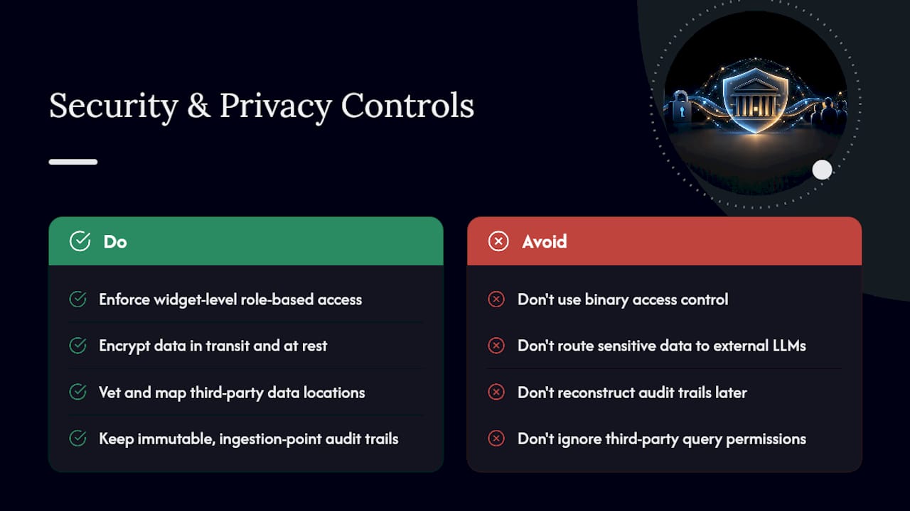
Access control has to be granular, not binary. A board member viewing an appetite summary should never see the same granular exposure data a credit analyst drills into, which means role-based permissions need to extend down to the widget level, not just the login screen. Encryption matters both in transit and at rest, particularly for feeds pulling from SIEM systems or trading platforms where a compromised connection could expose live positions.
Third-party data exposure deserves specific scrutiny. Every external feed, whether it's a peer benchmarking service or a fraud detection vendor, is a potential point of leakage, and institutions should know exactly where their data physically resides and who can query it. This is precisely why in-house AI processing, rather than routing sensitive borrower data through external large language model providers, has become a differentiator for platforms serving regulated financial institutions.
Audit trails need to be immutable and timestamped at the point of ingestion, not reconstructed after the fact. Regulators reviewing a compliance dashboard will ask not just what the score showed, but who could see it, when it changed, and what evidence backed the change. A dashboard that can't answer those three questions on demand will struggle in an exam, no matter how good its visualizations look.
What Goes Wrong When Institutions Deploy Real-Time Dashboards?
The most common failure isn't technical. It's scope creep: a team sets out to build one focused dashboard and ends up trying to stream every available data source into it, because someone in a planning meeting asked "can we also add..." one too many times. The result is a dashboard so cluttered that nobody trusts it, and adoption collapses within a few months.
Alert fatigue is the second major pitfall. Set thresholds too aggressively and operational teams start ignoring notifications entirely, which defeats the purpose of real-time alerting. The fix is tuning thresholds against historical false-positive rates before launch, not after the team has already learned to tune out the noise.
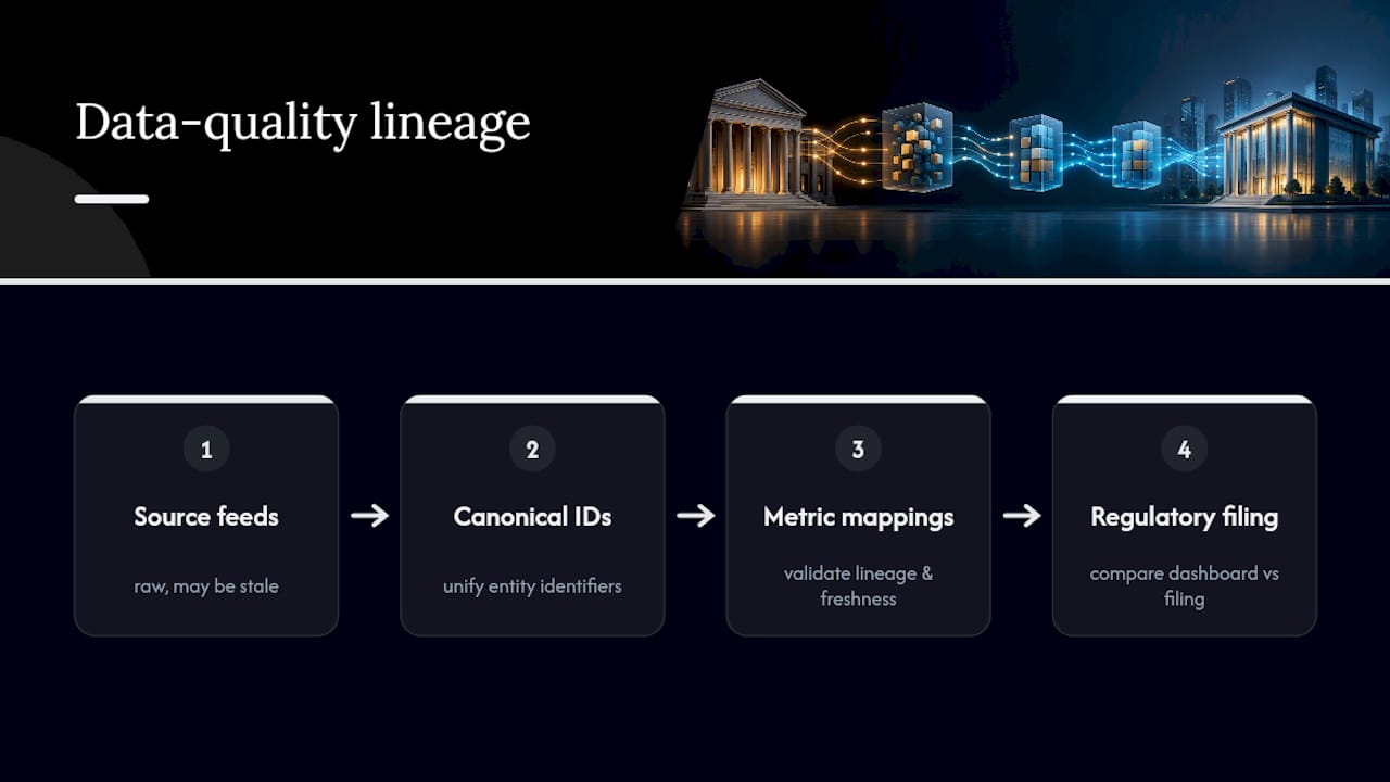
Data quality gaps surface later than expected, usually the first time a number on the dashboard contradicts a number in a regulatory filing. That mismatch is almost always a lineage problem, a metric pulling from a stale or improperly mapped source, rather than a dashboard bug. Institutions that skip the validation and canonical-identifier work upfront pay for it in credibility later.
Finally, many teams underestimate change management. A dashboard that replaces a familiar spreadsheet or weekly report needs training, a transition period where both exist in parallel, and a named champion in each business line who can answer "why does this number look different" questions during the first few weeks. Skipping that step is the fastest way to get a technically excellent dashboard that nobody actually uses.
Where Are Real-Time Risk Dashboards Already Proving Their Value?
Financial services is the clearest proving ground, largely because the cost of delayed detection is measured in dollars and regulatory exposure simultaneously. Credit unions and community banks using live portfolio monitoring dashboards can catch delinquency trends shifting weeks before they'd surface in a monthly report, giving underwriting and collections teams a head start on intervention.
Cybersecurity teams across industries have adopted a similar model, combining live threat intelligence feeds with vulnerability scoring to produce composite risk scores that recalculate on a multi-hour cycle rather than waiting for a weekly scan report. That cadence balances responsiveness with the practical reality that constant re-scoring produces more noise than insight.
Geopolitical risk monitoring offers a third example, and one investment teams increasingly rely on. Dashboards that track conflict-related scores on a rolling basis, updating within a seven-day window and pushing alerts when scores cross defined thresholds, let portfolio managers react to escalating regional instability without waiting for a quarterly risk committee to convene. The common thread across all three sectors: real-time visibility earns its cost in domains where the gap between "we should have known" and "we knew immediately" translates directly into avoided losses.
When Is Real-Time Visibility Essential, and When Is It Overkill?
Not every risk domain deserves a live feed, and treating all of them the same way wastes budget without improving outcomes. Cyber incidents, liquidity stress, and active trading exposure genuinely need real-time or near-real-time visibility, because a delay of hours in any of those domains can compound losses fast enough to matter.
Most operational and compliance risk domains don't need that same urgency. Daily or even weekly refresh is often perfectly adequate for tracking training completion rates, policy exception counts, or vendor risk reassessments. Building sub-second infrastructure for metrics that only get reviewed weekly is a staffing and budget decision most institutions will regret. The smarter move is triaging which domains genuinely justify the engineering cost of true real-time delivery, then defaulting everything else to a slower, cheaper cadence.
— Raj
Get a Real-Time Dashboard Built for Your Institution
Building the architecture described above from scratch, ingestion pipelines, canonical identifiers, role-based templates, audit-ready evidence links, takes most internal teams months of engineering time they don't have to spare. This platform is designed specifically for credit unions, community banks, and lenders that need that visibility now, without exposing borrower data to third-party infrastructure along the way.
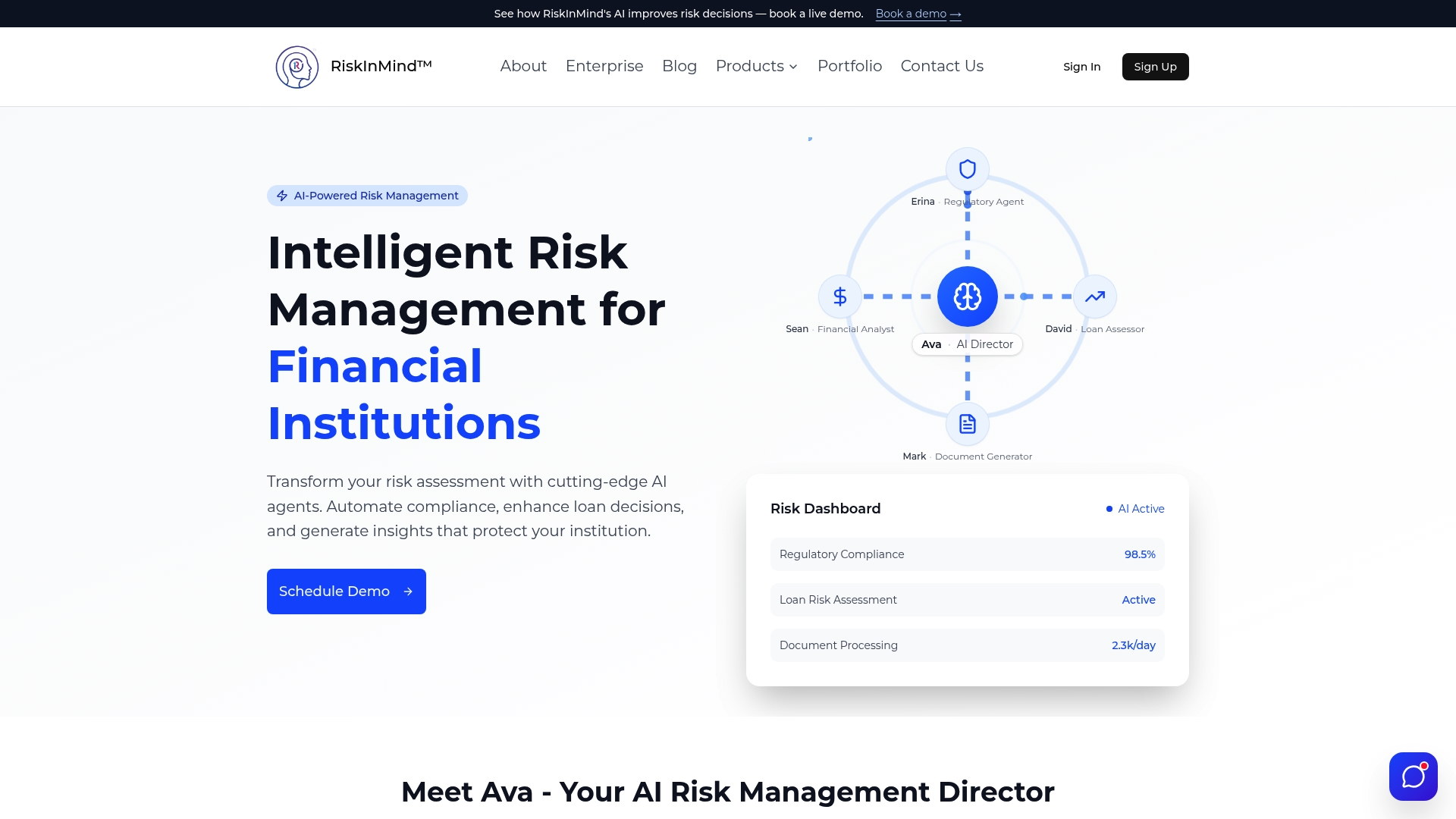
The Bank OS and Portfolio product lines map directly to the dashboard outcomes this article covers: composite risk scoring, role-based views for boards and CROs, and drill-down evidence trails backed by sub-second processing. If your priority is credit portfolio visibility specifically, the Loan Application module folds real-time signals directly into underwriting workflows rather than treating the dashboard as a separate reporting layer.
When you request a demo, ask to see the confidence bands behind a composite score, the click-through audit trail on a single KPI, and how quickly a threshold breach reaches an alert. Plans scale from Starter through Enterprise, with details on Riskinmind's pricing page to match your institution's size and rollout pace.
FAQ
What Are Real-Time Dashboards?
A real-time dashboard is a live data display that updates continuously or near-continuously as new information arrives, rather than refreshing on a fixed daily or weekly schedule. In risk management, that means current scores, thresholds, and alerts replace static reports that were already outdated by the time someone read them.
What Are the Five Components of ERM?
Enterprise risk management frameworks vary by source, but most describe five recurring elements: governance and culture, strategy and objective-setting, performance-linked risk assessment, review and revision, and information/communication/reporting. Real-time dashboards primarily strengthen the last of these, giving the reporting layer continuous rather than periodic visibility.
What Is a Good Dashboard for Risk Management?
A strong risk dashboard combines a composite risk index with confidence bands, role-based views for board and operational audiences, and evidence-linked drill-through on every KPI. Platforms like Riskinmind build these features specifically for financial institutions that need audit-ready traceability alongside sub-second processing.
What Are the Four Types of Dashboards?
Dashboards are commonly grouped into strategic (board-level trends against appetite), operational (day-to-day incident and issue tracking), analytical (deep drill-down for investigation), and tactical or departmental (mid-level views for a specific function like credit or compliance). Most institutions need at least two of these types running in parallel, since a single view rarely serves both a board member and a frontline risk analyst well.
How Often Should a Real-Time Risk Dashboard Actually Update?
Update frequency should match the cost of delay in that specific risk domain, not a single fixed standard. Cyber and trading exposure often warrant minute-by-minute or hourly recalculation, while some industry threat composite scores recalculate on a roughly six-hour cycle, and slower-moving operational metrics hold up fine on a daily or weekly refresh.