
Most risk professionals at financial institutions have experienced this: a dashboard that looks polished in a vendor demo but falls apart the moment you need it to support a real governance decision. The risk dashboard features checklist approach exists precisely to prevent that outcome. Rather than evaluating tools based on visual appeal or feature count alone, a structured checklist forces a disciplined assessment of whether each feature actually delivers decision-ready risk visibility. This article walks through every critical capability your risk management dashboard must possess, organized by function, to help you identify gaps, compare options, and hold vendors accountable to standards that matter in practice.
Table of Contents
- Key takeaways
- 1. Core data integration and visualization features
- 2. Advanced interaction and usability features
- 3. Comprehensive checklist of specialized dashboards and key features
- 4. Technical and operational considerations for governance and workflow integration
- 5. Evaluating, comparing, and selecting risk dashboards
- My honest take on what actually fails in the field
- See how Riskinmind meets this checklist in practice
- FAQ
Key takeaways
| Point | Details |
|---|---|
| Checklist over demos | Use a structured risk dashboard features checklist to assess real governance value, not just visual design. |
| Real-time data is non-negotiable | Dashboards with stale data create false confidence; automated feeds and refresh rates must be verified. |
| Thresholds must trace to appetite | Traffic-light KRI systems are only defensible when thresholds originate directly from the risk appetite statement. |
| Drill-downs determine governance quality | Board-level summaries must connect seamlessly to metric detail, tolerance limits, and assigned action plans. |
| Workflow fit prevents manual stitching | The best dashboard fails if it forces analysts to export data and reassemble it elsewhere after every refresh. |
1. Core data integration and visualization features
A risk management dashboard is only as reliable as the data feeding it. The first thing your checklist should confirm is whether the platform integrates directly with your risk register, key risk indicator systems, risk appetite metrics, and treatment or action tracking tools. Without these four connections, your dashboard is reporting on a subset of your risk picture while presenting it as the whole.
Board-ready ERM dashboards translate risk register and KRI data into a decision-ready view that answers three questions simultaneously: what is the current exposure, how severe is it, and what actions are in flight. If a dashboard cannot answer all three without manual workarounds, that is a material gap.
Equally important is update frequency. Automated real-time or near-real-time data updates are not a premium feature. They are the baseline expectation. A dashboard refreshed manually once per week creates an institutional blind spot that can persist through an entire stress event before anyone notices.
On the visualization side, your checklist should include risk heatmaps, traffic-light KRI displays, and trend arrows showing directional movement over time. These are the three most universally understood visual formats for risk reporting, and their absence or poor implementation is a red flag. Best practice limits each dashboard page to one topic and no more than three impactful visuals per page, preventing the cognitive overload that causes executives to disengage. Every visual should carry a short plain-language commentary field. Data without narrative forces each reader to draw their own interpretation, which is not governance. That is guesswork.

Pro Tip: Ask vendors specifically how commentary fields are updated. If the answer is "manually by administrators," that workflow will break under time pressure during a risk event.
2. Advanced interaction and usability features
Static dashboards serve static organizations. Financial institutions face dynamic, interconnected risks that require interactive visualizations with filtering, layering, and progressive disclosure so analysts can explore rather than just view. Your checklist should confirm these interaction capabilities exist before any other evaluation criterion.
Drill-down functionality is one of the most frequently overstated and underdelivered features in vendor presentations. A genuine drill-down does not simply link to a data table. It reveals the trend, the tolerance limits, the explanation of the current status, and the assigned action plan for any risk flagged amber or red. Board dashboards must maintain auditability through drill-downs that show exactly this sequence, making governance conversations targeted and traceable rather than broad and speculative.
Role-based customizable views are another non-negotiable item on your dashboard feature list. A board member and a credit risk analyst are asking fundamentally different questions of the same data. The board needs a strategic summary that maps metrics to appetite thresholds. The analyst needs the underlying drivers and trend data. A single static view cannot serve both, and forcing either audience to filter through irrelevant content damages adoption and decision quality.
Alert and notification systems must tie directly to defined risk appetite thresholds, not arbitrary percentages. Without that linkage, color coding becomes subjective and legally indefensible in a regulatory examination.
Pro Tip: During vendor evaluations, ask the vendor to demonstrate a drill-down live from a board-level heatmap to an individual KRI's action plan. The number of clicks and screens required tells you everything about their actual workflow design.
3. Comprehensive checklist of specialized dashboards and key features
Moving beyond foundational features, a fully capable risk management dashboard environment for a financial institution should include the following specialized views as part of any complete dashboard feature list.
- Enterprise risk summary dashboard that presents a board-ready, single-page view of top risks ranked by exposure and velocity, with direct linkage to risk appetite status.
- Risk appetite monitoring dashboard showing current KRI values against defined thresholds, with color coding that traces back to the formal risk appetite statement, not editorial judgment.
- Treatment and action tracker displaying remediation status on flagged risks in real time, including owner, due date, and completion percentage, so the board can see whether identified risks are actually being managed.
- Compliance posture dashboard covering regulatory obligations, examination findings, and control effectiveness by domain.
- Cyber risk and information security dashboard tracking vulnerability posture, incident trends, and third-party system exposure.
- Business continuity and operational resilience dashboard monitoring recovery time objectives, tested scenarios, and dependency maps across critical business functions.
- Third-party and vendor risk dashboard displaying concentration risk, contract status, due diligence completion rates, and performance scores across material relationships.
- Emerging risk monitor that captures horizon risks being tracked but not yet fully quantified, with commentary on trajectory and potential impact.
- ESG and climate risk dashboard that, particularly for institutions with CRA obligations or investor reporting requirements, tracks relevant climate exposure and social risk metrics alongside financial performance.
Each of these specialized dashboards should follow the one-page-per-topic principle and carry plain-language commentary. A KRI framework and dashboard that covers this full domain spectrum gives the risk function genuine breadth without sacrificing depth on any individual risk category.
4. Technical and operational considerations for governance and workflow integration
A risk dashboard that functions well in isolation but disconnects from your governance workflows creates a different kind of risk: the risk of organizational workarounds. Your checklist must evaluate technical and operational fit with the same rigor you apply to features.
Escalation matrices are the clearest test of operational readiness. Specifically, Yellow threshold breaches should be reported within 24 hours to designated risk owners, while Red threshold breaches require immediate escalation to senior leadership and, where applicable, regulators. Pre-authorized response actions should be assigned to each alert stage so that stress conditions do not trigger delay while waiting for approval on next steps.
| Feature | Minimum requirement | Strong implementation |
|---|---|---|
| Escalation triggers | Color-coded threshold alerts | Role-specific alerts with defined escalation paths |
| Audit trails | Log of user activity | Immutable logs with timestamp and action detail |
| Version control | Dashboard snapshots | Full versioning with stakeholder access and change documentation |
| System integration | Manual export to GRC | Direct API integration with GRC, SIEM, and financial systems |
| Pre-authorized responses | General response guidelines | Stage-specific, pre-approved response protocols |
Audit trails and immutable logs are a regulatory requirement that many vendors treat as an afterthought. Every change to threshold settings, every alert acknowledgment, and every dashboard access should be logged with enough detail to reconstruct the institution's awareness and response posture during any given period. This is not optional in a regulatory examination context.
Workflow-first dashboard design and clear ownership prevent the manual stitching that undermines trust in risk reporting. Your dashboard should integrate directly with your GRC platform, SIEM tools, and financial systems, not serve as a reporting layer that requires analysts to export, clean, and reformat data after every refresh.
5. Evaluating, comparing, and selecting risk dashboards
Once you have your risk dashboard features checklist in hand, the evaluation process itself requires discipline. Vendor demonstrations are designed to show strengths, not surface weaknesses. Your job during a demo is to break the workflow.
The most revealing tests include exporting data to assess how much formatting is lost, navigating audit logs to measure access speed and completeness, and testing drill-down paths from board-level summaries to individual KRI action plans. Evaluating vendor dashboards should prioritize workflow fit, export quality, audit data linkage, and minimal manual intervention after rollout. Any dashboard requiring significant post-implementation manual effort signals a design that was built for demos, not daily operations.
Beware of dashboards overloaded with metrics. More indicators do not mean more insight. Visual clutter dilutes focus and trains users to skim rather than engage. Institutions sometimes compound this problem by adding KRIs over time without retiring outdated ones, turning a functional risk management dashboard into a report that nobody fully reads.
Threshold calibration is a common failure point that surfaces only after go-live. Traffic-light systems require thresholds originating from the institution's own risk appetite statement, with explicit explanation fields, designated owners, and action pathways for amber and red statuses. A vendor that ships with generic default thresholds is asking you to accept their risk judgment in place of your own.
- Confirm drill-down paths reach action plans, not just data tables.
- Verify escalation pathways are configurable by role, not just by risk category.
- Test commentary fields under time pressure to confirm they are practical to update.
- Assess how quickly the dashboard reflects threshold changes after a risk appetite review.
Pro Tip: Ask the vendor for a list of integrations that went live within the past 12 months, alongside the name of a reference client willing to speak specifically about post-implementation workflow. That conversation will tell you more than any feature matrix.
My honest take on what actually fails in the field
I've worked through enough risk management implementations to say this with confidence: the dashboard features that look best on a slide are rarely the ones that determine success. The features that matter are almost always the ones vendors mention last.
In my experience, alert escalation protocols are the single most underspecified element in dashboard procurement. Institutions spend months evaluating visualizations and almost no time confirming that a Red threshold breach will automatically notify the right people in the right sequence. That oversight becomes visible only during a real stress event, which is exactly the wrong time to discover it.
I've also seen the manual stitching problem destroy organizational trust in risk data. When analysts spend two hours every Monday reformatting dashboard exports before the risk committee meeting, they stop treating the dashboard as a source of truth. The real-time risk monitoring case is not just about speed. It is about preserving the integrity of the data chain from source to decision.
The progressive disclosure principle matters more than most professionals realize before they've used it in practice. A board member who can click from a summary heatmap directly to a KRI explanation and action plan without leaving the platform will engage with risk data in a way that a separate PDF attachment will never achieve.
My practical advice: run your evaluation against the checklist in this article, then run it again specifically on governance workflows. The dashboard that wins on governance wins in practice.
— Raj
See how Riskinmind meets this checklist in practice
Financial institutions that have worked through the risk dashboard features checklist often find the same gap: platforms that deliver strong visualizations but fall short on real-time data integration, role-based views, and escalation governance. Riskinmind's AI-powered risk management platform is built specifically to close those gaps.
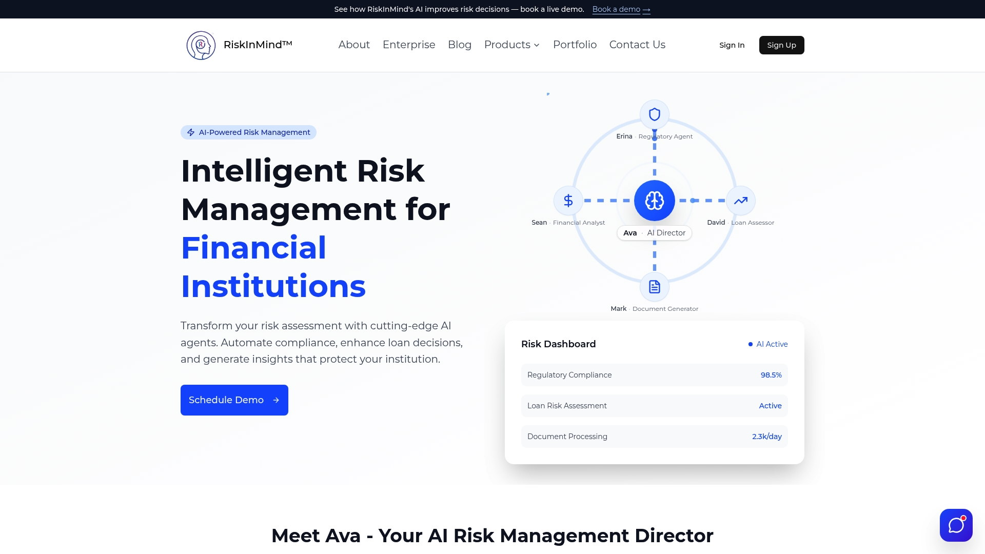
Riskinmind delivers automated data feeds with sub-second processing, configurable role-based dashboard views for board members through to analysts, and escalation matrices tied directly to your institution's risk appetite thresholds. Audit trails, version control, and direct integration with GRC and financial systems are built into the platform's core architecture rather than added as optional modules. With SOC 2® certification and bank-grade security, Riskinmind gives credit unions, community banks, and lenders a risk management platform designed around the standards your examiners and board actually expect. Request a demo to see the full checklist in action.
FAQ
What is a risk dashboard features checklist?
A risk dashboard features checklist is a structured evaluation tool that risk professionals use to assess whether a risk management dashboard covers all critical capabilities, including data integration, KRI visualization, escalation protocols, audit trails, and role-based access.
What key risk indicators should appear on a financial institution dashboard?
KRIs should be predictive, measurable, and tied directly to business impact, with thresholds set from the institution's risk appetite statement and clear owners and action pathways assigned to amber and red statuses.
How often should risk dashboard data refresh?
Real-time or near-real-time data refresh is the standard expectation for operational risk dashboards, as stale data creates blind spots that can persist through an entire stress event before being detected.
What is the biggest mistake institutions make when selecting a risk dashboard?
The most common mistake is prioritizing visual design over governance workflow fit, particularly failing to verify that escalation pathways, drill-down depth, and audit trail completeness meet regulatory and board accountability requirements.
How many metrics should a risk dashboard display?
Best practice limits each dashboard page to one topic with no more than three primary visuals, as overloading metrics causes user fatigue and dilutes the focus needed for sound risk decisions.