
A credit risk dashboard consolidates loan-level, bureau, and portfolio data into one governed view so risk teams can spot deterioration before it becomes a loss. It should track probability of default (PD), NPL rate, and population stability index (PSI) at minimum, giving CROs, portfolio managers, and model risk teams a live read on both borrower health and model reliability.
- Most dashboards should include risk KPIs like PD, LGD, and delinquency rates, with stress testing components that reflect macroeconomic scenarios.
- Metrics like Population Stability Index, model AUC, and KS scores should be tracked over time, with clear thresholds and color coding for quick assessment.
- The dashboard must integrate reliable, daily-updated data feeds, with role-based access controls, audit logs, and a documented escalation process for alerts.
- Model governance features, such as lineage tracking, champion/challenger comparisons, and explainability tools, are essential for ongoing model validation.
- Building an effective credit risk dashboard requires connecting decision-making modules with governance and monitoring tools, preferably through automated AI platforms.
Automate Regulatory Model Risk Governance
Examine models against 32 qualitative criteria and resolve risk Tiers with pre-deployment checklists per OCC 2011-12 guidelines.
Table of Contents
- Credit Risk Dashboard Modules and Layout Patterns
- Key Credit Risk KPIs and How to Calculate Them
- Visual Templates You Can Build This Quarter
- The Implementation Checklist: Data, Governance, and Security
- Model Monitoring Best Practices: PSI, Champion/Challenger, and Lineage
- How an AI Risk Platform Handles These Requirements
- Where to Look for Benchmarks and Templates
- Why Most Dashboard Projects Underdeliver
- Get a Credit Risk Dashboard Built for Your Portfolio, Not a Template
- Sources
Credit Risk Dashboard Modules and Layout Patterns
Most working dashboards follow a funnel logic: start broad with portfolio health, narrow into segments, then drill into a single obligor when something looks wrong. That sequence matters more than any individual chart choice, because it mirrors how a credit committee actually reasons through a problem.
The modules that show up in nearly every mature build:
- Portfolio overview — aggregate exposure, weighted average PD, and trendlines by vintage or origination channel.
- Segmentation views — breakdowns by industry, geography, product type, or risk grade, usually shown as stacked bars or a heatmap.
- Watchlist / early warning system (EWS) — accounts flagged by rule or model, sorted by severity and days since last review.
- Obligor drilldown — a single borrower's full history: score trajectory, covenant status, exposure, collateral.
- Scenario and stress panel — how the portfolio behaves under macro shocks, tied to CECL or IFRS 9 scenario sets.
Heatmaps work best for segmentation because they surface concentration risk at a glance, while cohort charts (vintage curves) are the right tool for tracking how a loan pool ages relative to prior origination periods. A single map widget rarely earns its screen space unless geographic concentration is a genuine driver of the institution's loss experience.
Key Credit Risk KPIs and How to Calculate Them
Three metrics anchor almost every credit dashboard, and getting their definitions loose is where a lot of internal disputes start.
- Probability of default (PD) — the modeled likelihood a borrower defaults within a defined horizon, typically 12 months for regulatory capital purposes.
- Loss given default (LGD) — the share of exposure not recovered after default, net of collateral and recovery costs.
- Exposure at default (EAD) — the expected outstanding balance at the moment of default, which for revolving lines requires a credit conversion factor.
- Delinquency and NPL rate — the percentage of the book past due or non-performing, usually segmented by days-past-due bucket (30/60/90+).
- Roll rates — the share of accounts moving from one delinquency bucket to a worse one each period, an early signal that outpaces NPL rate itself.
- Vintage/cohort curves — cumulative loss or delinquency by months-on-book, compared against prior vintages of the same product.
Model quality metrics deserve their own row on the dashboard. Population Stability Index (PSI) levels are typically interpreted qualitatively, where lower values signal population stability and higher values suggest the need for investigation or model review. Kolmogorov-Smirnov (KS) and AUC scores measure how well a model separates good and bad accounts, and both should be plotted over time, not just at validation. SAS's risk modeling documentation frames this kind of prebuilt KPI monitoring as central to keeping models aligned with regulatory expectations under IFRS 9 and CECL.
Visual Templates You Can Build This Quarter
A handful of widget templates cover most of what a credit team needs, and each one maps to a specific decision rather than existing as decoration.
- Portfolio health overview — needs total exposure, weighted PD, NPL rate, and a 12 month trendline. It answers the question a board member asks first: is the book getting better or worse.
- Early-warning watchlist — pulls accounts by rule-based triggers (covenant breach, score drop of a set number of notches, payment irregularity) plus a "recent change" column showing 30 day score movement. This is the widget analysts open every morning.
- Obligor profile card — shows score lineage (which model version produced the current score), total exposure across products, collateral value, and covenant status on one screen. It replaces the manual file pull that used to take an analyst twenty minutes.
- Cohort heatmap — vintage on one axis, months-on-book on the other, colored by cumulative default rate. Open-source examples on platforms like GitHub show how teams combine this kind of cohort view with PSI tracking in a single Power BI or Tableau workbook.
The Implementation Checklist: Data, Governance, and Security
Dashboards fail less often because of bad charts and more often because of unreliable inputs or unclear ownership. Before launch, confirm these are in place:
- Data feeds — loan-level origination and payment data, bureau pulls, collateral valuations, and macro overlays, refreshed daily for payment status and monthly for bureau and macro inputs.
- Governance — a named owner for every alert type, a defined SLA (e.g., watchlist items reviewed within 48 hours), and an escalation path to credit committee for anything breaching a hard threshold.
- Audit trail — every score change logged with model version, timestamp, and the analyst or system that acted on it.
- Access control — role-based views so a branch underwriter sees obligor detail while a board member sees portfolio aggregates only.
- Security posture — SOC 2 attestation is a reasonable baseline to ask any vendor or internal IT team to meet.
- System integration — direct feeds from the loan origination system (LOS), core MIS, and the model repository so the dashboard isn't running on a stale export.
Pro Tip: Build the escalation path before you build the alert logic. A dashboard that flags fifty accounts a week with no owner assigned to each one trains your team to ignore it within a month.
Model Monitoring Best Practices: PSI, Champion/Challenger, and Lineage
A dashboard that only shows borrower risk is half the job. The other half is proving the scoring model itself still works, and that means baking model governance into the same screens analysts check daily.
- Surface PSI with color-coded action flags rather than a raw number buried in an appendix. A green/amber/red banding tied to the 0.1 and 0.25 thresholds turns a statistic into a decision.
- Run champion/challenger comparisons in a sandboxed view so the current production model and its proposed replacement score the same accounts side by side, before any cutover decision gets made.
- Tie every score to its model version and data snapshot. SAS Communities frames this lineage requirement as central to satisfying both internal audit and external examiners, since a score without a traceable version is effectively unverifiable after the fact.
- Add explainability artifacts, such as SHAP value summaries, next to any machine learning driven score so an examiner or credit officer can see which variables actually moved the number. Experian's analysis of credit risk analytics trends points to this kind of explainability, alongside near real-time processing and bias monitoring, as the direction the discipline is moving.
How an AI Risk Platform Handles These Requirements
Building all of this in-house, from PSI tracking to champion/challenger sandboxes to a full audit trail, takes a real engineering budget and months of validation work. That's the gap platforms purpose-built for financial institutions are designed to close.
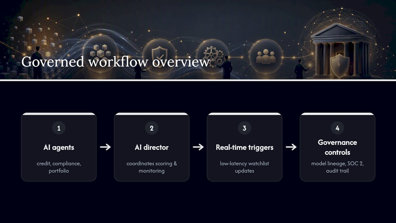
Some AI risk platforms assign specialized AI agents to credit risk assessment, compliance monitoring, and portfolio analysis, coordinated by a central AI director so scoring and monitoring happen under one governed workflow rather than across disconnected tools. Real-time processing with low latency means a watchlist trigger can reflect the latest payment or bureau update almost immediately, rather than after an overnight batch job. Scores carry model lineage information important for audit purposes, and certain platforms run on SOC 2 certified infrastructure, addressing access-control and security baselines needed for dashboard rollouts. Portfolio managers evaluating a vendor for this kind of work can review the portfolio manager solutions page for how these pieces fit together operationally.
Where to Look for Benchmarks and Templates
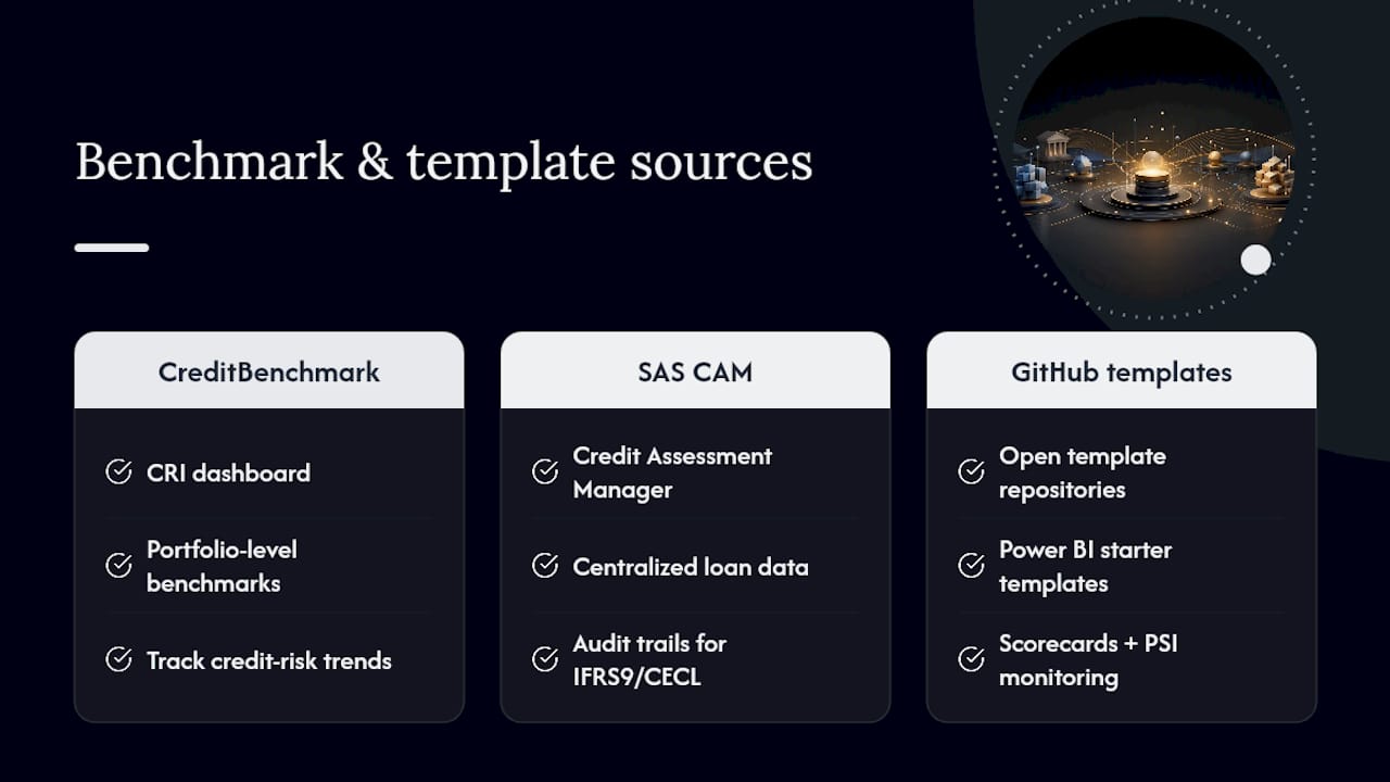
For portfolio-level context beyond your own book, CreditBenchmark's CRI dashboard tracks credit-risk trends across institutions and is worth checking against your internal PD movement. SAS's Credit Assessment Manager documents how centralized loan data and audit trails support IFRS 9 and CECL workflows, and open template repositories on GitHub offer a starting point for Power BI builds that combine scorecards with PSI monitoring.
Why Most Dashboard Projects Underdeliver
The research behind this piece points to one consistent failure mode: institutions build dashboards as reporting artifacts instead of decision infrastructure. A chart that shows NPL rate ticking up is useless if nobody owns the next step. That's the real lesson here, not the KPI formulas.
Conventional advice treats model monitoring and portfolio monitoring as separate disciplines with separate tools. That split is where governance gaps open up. If your PSI tracker lives in a data science team's notebook and your watchlist lives in a risk analyst's spreadsheet, nobody sees the connection when a drifting model starts producing watchlist entries that don't match reality.
Prioritize the alert-to-owner mapping before you prioritize widget design. A beautifully designed obligor drilldown that nobody is required to check within a defined SLA is decoration, not risk management. Get the escalation path and the model lineage tracking right first. The visualizations matter, but they're the part that's hardest to get wrong and easiest to fix later.
— Raj
Get a Credit Risk Dashboard Built for Your Portfolio, Not a Template
Building the checklist above in-house, PSI monitoring, champion/challenger sandboxes, model lineage tracking, real-time feeds, typically means stitching together a BI tool, a model repository, and a compliance layer that were never designed to talk to each other. Some governance stacks connect credit risk assessment and compliance monitoring under one system with AI agents, reducing the need to manage multiple disconnected tools.
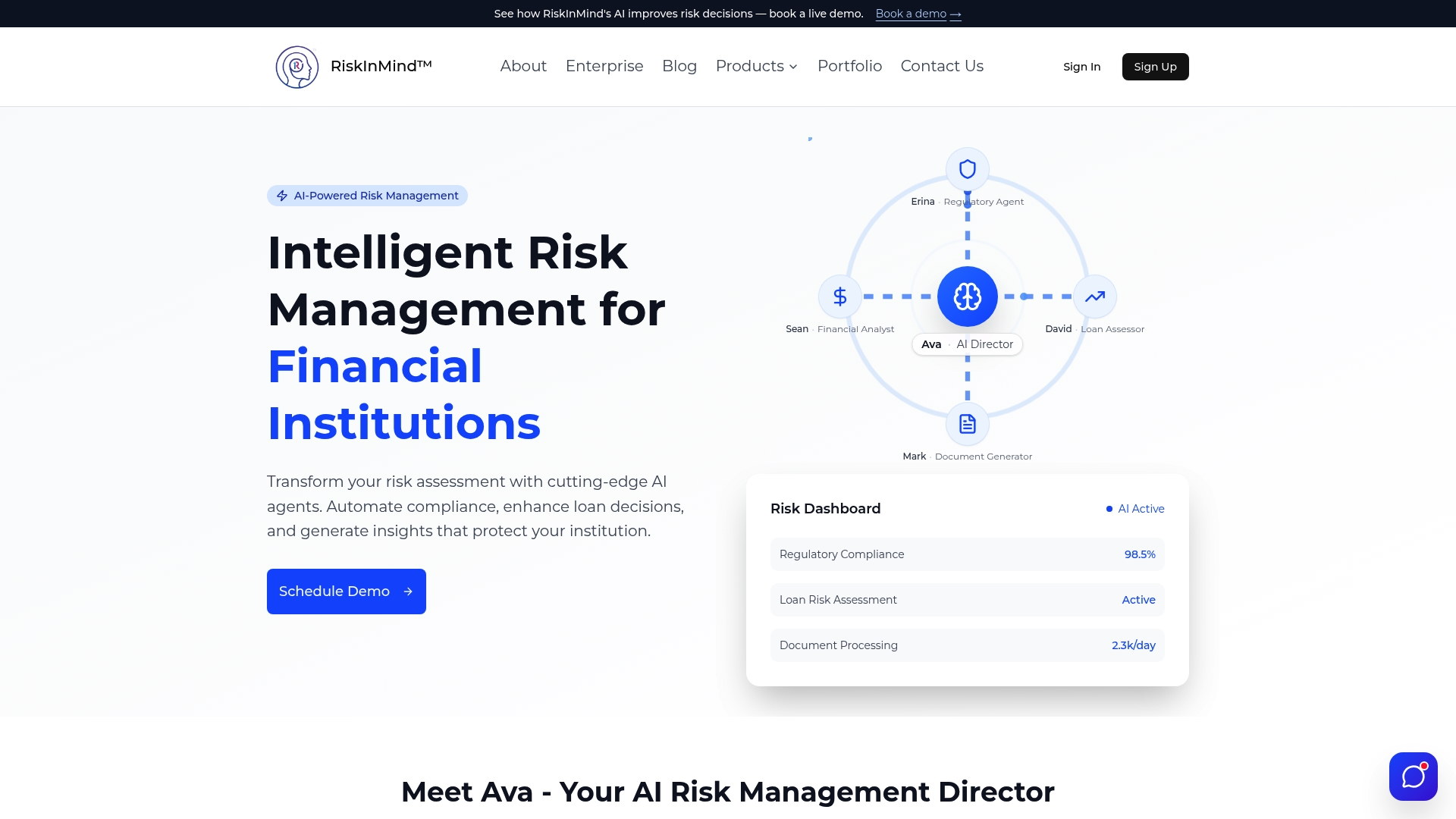
That matters most for institutions that want the audit trail and explainability examiners expect without adding headcount to maintain it. If you're weighing whether to build or buy, start with the loan application and underwriting product page to see how real-time scoring and dashboard integration work together, or review the peer benchmarking tool if portfolio-level comparison against market indices is your immediate priority. Either page includes a path to request a demo against your own portfolio data.
Sources
- SAS Risk Modeling: Develop, validate, deploy and monitor credit and risk models
- What is credit risk analytics and what are the latest trends? — Experian